

A couple things to remember about this... EA is produced before most teams paint their ice for the upcoming season so I have used reference shots from the previous season because that is what they are attempting to work off of. Also keep in mind that anniversary logos do not appear in the EA NHL games as they would be old news by the time the game came out.
Finally, I should mention that I do not go into detail on the white trim around the red lines. They are the same for every rink in the game this year. I would normally nitpick about something like that but in previous years many ices didn't have ANY white trim and the logos simply touched the red line. I don't know of hardly any teams that have done that in the last decade so even a standard trim looks better than none at all.
Lets get started!
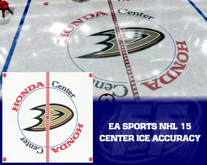
Anaheim: The top half of the red line should face the opposite direction. Otherwise looks good.
Arizona: Obviously the arena name officially took place after NHL 15 development had been completed so there was no chance of the new arena name being in the game. Glad they were able to leave the old name in so the rink looks realistic at least.

Boston: Perfect, and as a bonus you can find this year's solid red line in the game as well if you play in Boston on NHL Moments Live.

Buffalo: I think the logo size might need adjusting, or perhaps ours does. Oh well, looks very good either way.

Calgary: They actually got the authentic arena text which I have been unable to match so far. Ill work on that! Perfect recreation EA!

Carolina: One of two arenas not licensed in the game. PNC Arena assured us on Twitter that they are in talks with PNC regarding the future of their likeness being included in the EA NHL Series. Now if EA could just stop being lazy with their red line... How hard would that red line be to recreate?

Chicago: And here is the other unlicensed arena this year. Glad to see they got rid of the Chicago Stadium text after realizing that NHL is not played in stadiums, unless of course they are outdoor games. Red line could use some work as they seem to have this generic boxed red line on many ices this year.

Colorado: Fix that "CENTER" font and you have a perfect recreation.

Columbus: They never did have much luck recreating the arena text. At least now it has changed in real life so next year they can have a fresh start at the new text layout. The red line stars are very big but ast least this year they aren't all disfigured.

Dallas: Bold that font and straighten the stars and you've got it!

Detroit: The generic boxed red line is is use again but this time it sort of works. That pattern is not far off from the real thing. They never get the "Detroit Red Wings" font quite right and perhaps shrink the arena text a bit.

Edmonton: The font looks to be outdated still but this ice wont be around much longer anyway, Besides that it looks great in game!

Florida: We compare these designs to the previous season because that is all EA has to work with at the time they make these games. Anniversary logos are never used in game as they would date the game almost immediately. They pretty much nailed this ice as best as they could have guessed. We even assumed that the Panthers would go back to their diamond red line this season with the return of their primary logo but they did not. Personally I like the solid red line better and perhaps EA could update that easily in a patch, who knows.

Los Angeles: Always good to perfect the championship team's center ice in the game!

Minnesota: The generic red line is back but hey, its pretty close.

Montreal: Several Habs fans had high hopes that EA would finally update the arena text font, but not this year. Shoot us a message EA, we can help you out on this! The red line is not quite right, though I have to say it looks better in game than on the real ice.

Nashville: Nicely done!

New Jersey: EA must not want to spend time on the spacing of boxes on red lines so they go with the generic once again. Works pretty well here though.

New York Islanders: Nassau Coliseum is FINALLY licensed! I guess in all that excitement, EA forgot to recreate their red line... you know, the ONLY red line design they have EVER used. Also the logo appears to be an older version and the outline looks pretty bad.

New York Rangers: MSG makes its return to the ice and isn't it a great site. The generic red line makes another appearance though. They took alot of pride in their Madison Square Garden arena recreation so I sure wish they would have finished it off with that uniquely spaced red line design.

Ottawa Senators: The new arena name looks perfect this year! The red line design is solid logos rather than detailed logos and that surprising stands out a lot. Maybe next year!

Philadelphia Flyers: Looks pretty good. I think i would make the arena text a bit more bold, but certainly not a big issue.

Pittsburgh Penguins: Perfect! What more can I say?

San Jose Sharks: So great to see the Sharks home ice licensed and back in the NHL series. Pefect arena text and all that really needs work is the generic red line. In recent years the red line has looked worse in the game though so I can live with this.

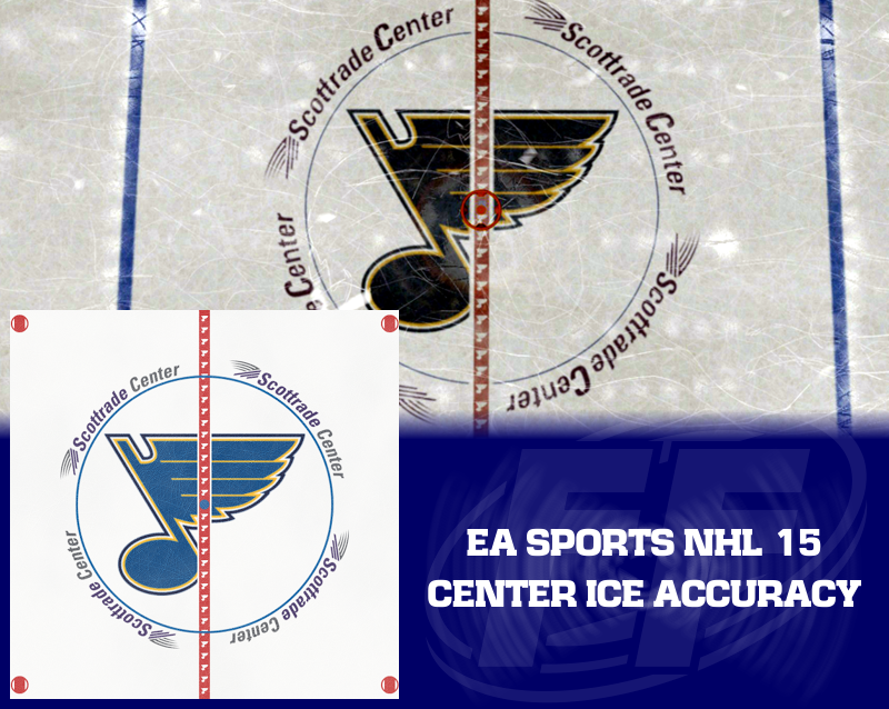
Saint Louis: Perhaps I am more picky on the Blues ice as they are my favorite team, but there are a couple issues that they have missed for a few years now. The Blues logo seems to dark in game (yes its hard to tell this year with the new ice textures in the game). the thing that stands out the most to me is the arena text. The font is dead on but the size is a bit too large and too far from the center circle. Also the words should be in purple and gray.
Tampa Bay: Another case where the arena name changed too late in the development process, but hey, it could be worse. We could have ended up with no arena name at all like in past years for some teams.

Toronto: A little tweaking could be done to the font, but honestly, its not broken so I wouldn't worry about fixing it.

Vancouver: Hmmm, this is EA Canada's hometown rink which they have stated they have visited, so why can't they get their own red line accurate. This year it got the old generic box treatment. Otherwise it looks good.

Washington: The arena text could be more bold but other than that, looks good.

Winnipeg: Looks great!

.
No comments:
Post a Comment